


Best Custom Volleyball Jersey Designs: A Coach's Guide

A jersey can look striking on a screen and still fail when players line up across a crowded court. The best custom volleyball jersey designs make your team recognizable, keep names and numbers easy to read, and give players a consistent look without turning the uniform into visual clutter. Coaches can reach that balance by choosing a clear design direction before adding decoration.
What makes a volleyball jersey design work?
A strong volleyball jersey design has a clear visual order: the team identity stands out first, the player number remains easy to locate, and decorative elements support rather than compete with those essentials. It should also make sense across the full roster, fit the team’s colors and feel appropriate for the level of play. Start with function, then add personality.
Think about the jersey in the setting where it will be worn. Players move quickly, teammates and coaches need to identify them at a glance, and a design must still look coherent from the sideline or in a team photo. A small preview on a computer can make tiny lettering seem larger than it will appear on the garment. Review the design at realistic scale and inspect it from a distance.
Good design is not the same as a complicated design. A restrained layout can feel distinctive through color placement, a strong contrast panel, a subtle pattern or a well-considered neckline. Too many competing effects can obscure the team name and number. Pick one or two visual features to carry the identity, then keep the supporting details quieter.
Make the design work for the whole program, not just one mockup. Consider how the chosen colors will translate to every roster member, whether the team needs a contrasting alternate, and how the jersey will coordinate with shorts and warm-ups. If players will wear different sizes, check that the main design elements remain balanced across the size range. The custom volleyball uniforms page is a useful starting point for exploring team uniform options.
Which design direction fits your team?
Choose a design direction by matching the team’s personality to a layout that stays legible and easy to reproduce across the roster. Classic panels, color blocking, tonal patterns and bold side accents can all work. Decide which one feature should define the look, then use the remaining space to keep the team name, number and colors clear.
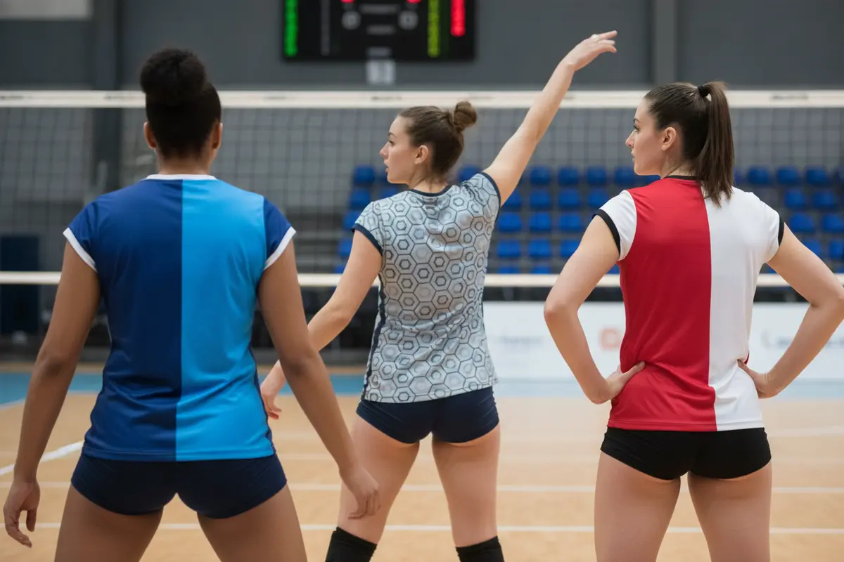
Classic panels use blocks or stripes to create a traditional volleyball look. They suit programs that want a clean, established appearance and make it straightforward to coordinate the jersey with shorts. A panel can frame the number or add contrast along the side without filling every open area.
Modern color blocking puts two or more large color fields together. It can make a team stand out without relying on intricate artwork. Keep the number on an area with enough contrast, and check that the boundary between colors does not cut awkwardly through lettering or the number outline.
Tonal or geometric patterns add visual texture while allowing a primary team color to remain dominant. The pattern should be quiet enough that it does not reduce the contrast of names and numbers. Ask to inspect the artwork at the size it will appear on the jersey, not only as a close-up on a screen.
Minimal designs rely on a strong base color, one clear accent and carefully placed lettering. Minimal does not mean generic: a distinctive collar, stripe or color transition can give the team a recognizable signature. This approach is also helpful when the program wants a look that can be carried into future seasons.
Before selecting a direction, collect a few references and write down what you like about each: the palette, the shape of a panel, the placement of a number or the overall mood. Do not ask a designer to combine every reference. Instead, identify the common thread and use it to guide one coherent concept.
Then compare the concepts against the same practical questions. Is the team name visible without overpowering the number? Does the design still feel balanced when viewed from the back and side? Can the central graphic be carried across the roster without awkwardly colliding with lettering? Will a player recognize the team’s colors quickly in a lineup? These checks help coaches separate a design that is merely eye-catching from one that works as a uniform. Invite a small group of decision-makers to review the options, but ask them to comment on the same criteria. Feedback such as “make it more exciting” is hard to turn into a useful revision; a precise note about contrast, placement or a color that does not match the program is actionable.
It can also help to consider how long the design should serve the program. If the team expects to use it for more than one season, favor a visual system that can accommodate new players and future additions. A distinctive accent can make a classic layout feel current without tying the identity to a short-lived trend. Ask the team whether it wants a timeless primary jersey, a special alternate, or both, and plan each one with a clear role. The uniform builder can help teams explore a visual concept and communicate their preferences.
Design approach | Visual effect | Best fit when | Check before approval |
Classic panels | Structured, familiar, and easy to coordinate | The program wants a traditional look with clear color sections | Confirm that numbers and lettering sit on a high-contrast area |
Color blocking | Bold and recognizable through large color fields | The team wants strong visual identity without a dense pattern | Check that color boundaries do not interrupt text or numbers |
Tonal pattern | Added texture while keeping a main color dominant | The team wants detail that does not take over the jersey | View the pattern at realistic size and test number readability |
Minimal layout | Clean, focused, and straightforward to carry across a set | The program prefers a restrained look or a reusable design | Make sure the accent and lettering still feel distinctive |
How should you choose colors and contrast?
Start with the colors your team already uses, then check how each combination supports visibility. A jersey needs enough contrast between its base, accents and lettering for the design to read clearly. Consider the gym lighting and the full uniform together; a palette that looks balanced on a digital swatch may feel different when large areas of color meet on the court.
Choose a dominant color first. This gives the rest of the design a stable foundation. Add one supporting color for panels or accents, then reserve a high-contrast shade for the number or lettering where needed. More colors can be included, but each should have a clear job. If every color is equally prominent, the design can lose a focal point.
When the program has established school or club colors, check whether all of them need equal space on the jersey. One color can carry the largest area while the others work as a narrow edge, collar detail or number outline. This keeps the palette recognizable without making the surface feel crowded. If the team has not settled on a palette, compare two or three combinations rather than asking players to choose from a long list. A smaller set of well-considered options makes it easier to discuss contrast, identity and coordination.
Look at the design on both light and dark color fields if the team expects more than one jersey version. A number treatment that reads clearly on the primary jersey may need a different outline or fill on an alternate. Make those choices deliberately and keep the two versions related through a shared type style, panel shape or accent. Avoid assuming that one identical treatment will remain legible on every background.
Contrast matters most around the player number and team lettering. A dark number on a dark panel, or a light number on a light field, can disappear from a distance. Ask to see the lettering against the exact background where it will sit. An outline may help separate the number, but layers of outlines and shadows can also make a simple number feel busy. Choose the clearest treatment rather than the most elaborate one.
Coordinate the jersey with shorts and any other pieces in the order. Decide whether shorts should repeat the jersey’s main color, pick up an accent or remain visually simple. If the team uses different jersey colors for home and away matches, make sure each version still reads as part of the same program. Carry one or two shared elements—such as a panel shape or consistent lettering style—across both.
Ask for the team colors in a form your program can reuse, such as documented color values or an approved physical reference, and keep that record with the design files. This can make later reorders and additions easier to discuss. For help gathering measurements and choosing sizes, review the team uniform sizing charts as part of the planning process.
Which jersey details should coaches settle early?
Settle the information that affects the layout before polishing decorative details: team name, player numbers, any names on the back, logo artwork and the placement of each element. A clear list prevents late revisions and helps the proof show the design the team actually intends to order. Confirm who has authority to approve each item before the roster deadline.
Numbers: Decide where the number should appear and how prominent it should be. Share any league or school requirements with the supplier before approving the artwork. Check that the number style is legible, that its color contrasts with the jersey, and that the treatment works on the actual panel rather than just the flat mockup.
Team name and logo: Confirm the correct spelling, artwork version and placement. If the program has a primary and alternate mark, identify which one belongs on the jersey. Provide the cleanest available artwork file and avoid using a screenshot or a low-resolution image when a proper file is available. Proofread every word in the final layout.
Player names: Decide whether names belong on the jersey and establish one spelling and format for every player. Confirm accents, capitalization and any naming conventions as a group. Name placement should be reviewed with the number and team name together, since a layout that works for one element in isolation may feel crowded once everything is present.
Decoration: Ask which decoration approach suits the artwork, garment and intended use. Teams may consider methods such as sublimation, screen printing, heat press, embroidery or tackle twill depending on the product and design. Each has different visual characteristics. Do not choose a technique based only on a small sample image; ask how fine details, color transitions and layered elements will appear in the proposed execution.
Uniforms Express offers multiple decoration methods, including tackle twill, sublimation, screen printing, heat press and embroidery. For a design that relies on a particular effect, ask the team to confirm that the method can reproduce it as shown. Keep the discussion focused on what the artwork must communicate, rather than assuming every effect will look identical across different processes.
How can you make the full uniform feel coordinated?
A coordinated uniform is a system, not a jersey selected in isolation. Bring the jersey, shorts, socks and any warm-up pieces into the same visual conversation. A shared palette and a repeatable graphic detail can connect the items, while simpler supporting pieces stop the full set from feeling overloaded. Plan the complete look before approving separate items.
Begin by choosing the jersey as the focal piece or deciding that the whole set should have equal visual weight. If the jersey already has a bold pattern, keep shorts cleaner and repeat only a small accent. If the jersey is minimal, a side stripe or matching detail elsewhere can make the package feel intentional. Repeating every graphic on every item is not necessary.
Check how the set works in both a team lineup and individual movement. The colors should look consistent across the pieces, but each garment has a different shape and available space. A graphic that fits a jersey panel may not translate naturally to shorts. Ask for the pieces to be shown together in the proof, with the same palette and design logic.
Consider future additions while the team is making its first decisions. Keep a copy of the approved artwork, color references, lettering choices and size information. Record which version is intended for each use, especially if the program has more than one jersey. A simple design record gives future coaches a useful reference when they need to ask about replacements or a new season’s order.
When comparing concepts, review the entire team set rather than choosing the jersey solely from a single close-up. Uniforms Express has a volleyball uniform overview for teams considering coordinated apparel. Bring a clear list of the pieces you need when you ask for guidance, so the design discussion covers the actual team order rather than only one garment.
What should a coach check on the design proof?
Review the proof as both a design and an order document. Confirm the right colors, artwork, text, number placement and roster information, then inspect how the finished layout will look at realistic size. Assign one person to collect feedback and submit a single, corrected set of notes. Approval should happen only after the team has resolved every open question.
- Check identity details.
Compare the team name, logo and any other text with the official source files. Proofread every character, including player names and punctuation. Do not rely on memory when the roster is changing.
- Review the numbers.
Confirm the correct number for each player and make sure the number style, contrast and placement remain clear. Check any applicable competition rules with the organization that governs your team.
- Inspect the color relationships.
Look at the design at normal viewing size and check that lettering does not disappear into a panel or pattern. Compare the jersey and companion pieces together.
- Match the roster to sizing.
Verify each player’s requested size against the team’s collected information. Use one roster document as the source of truth, and identify any late additions or changes before approval.
- Read the order details.
Confirm garment styles, quantities and decoration selections. Make sure the proof reflects the complete set the team expects, not only the sample jersey shown in the artwork.
- Save the approved version.
Keep the final proof with the roster and design notes. Send one consolidated list of corrections if revisions are needed, then check the revised proof before giving final approval.
For college programs, the NCAA’s official site is a starting point for finding current association information; coaches should confirm the uniform rules that apply to their particular competition before approving a design. Requirements can differ by governing organization and level, so do not assume that a design used by another team meets your program’s rules.
A proof is the moment to catch errors, not to rush through them. Ask questions if a detail is not shown clearly or if the proposed decoration differs from the intended look. It may help to print or view the artwork at a useful scale and review it with the roster beside it. Have a second person check names and numbers independently; the person who entered the information may overlook a familiar typo. Keep comments concrete: identify the garment, location and exact correction requested. When the revised proof arrives, compare it with the marked version and verify that every agreed change was made without introducing a new mismatch.
Separate design approval from roster approval when possible. The design reviewer can focus on colors, placement and visual balance, while the roster owner checks names, numbers, sizes and quantities. Both reviews should be completed before the team treats the order as final. Save the approved file and the final roster together, with a clear date or version label, so everyone refers to the same source. This simple handoff reduces confusion if several staff members are involved or a question comes up later. For a broader view of available team uniform options, explore Uniforms Express team apparel and bring your preferred design direction and ordering questions to the conversation.
How should you plan sizing, timing and the team order?
Plan the order around a complete, verified roster and the date the uniforms need to be ready. Collect sizes consistently, confirm quantities and allow time for design review, corrections and production planning. Do not treat a sample jersey or an early mockup as confirmation of every final order detail; the proof and order documents should agree before the team gives approval.
Give players and families a clear sizing process with a deadline. Explain how to review the available size information, who should answer questions and where the final selection will be recorded. Coaches should verify that no players are missing and that the roster uses consistent names and number assignments. Keep late changes in one place so the final submission is not assembled from scattered messages.
Build a calendar backward from the first date the team needs the uniforms. Include time for artwork preparation, team review, revisions, roster checks and supplier confirmation. Ask the supplier to discuss the timing available for the specific order, including any rush request, rather than assuming a standard timeline applies to every product and situation. Confirm turnaround and any related terms directly for the order being considered.
Assign responsibilities. One person should own the roster, another can gather player feedback, and a designated decision-maker should approve the proof. Too many uncoordinated reviewers can lead to conflicting changes or a series of preventable revisions. Set a cutoff for comments, then send one organized response identifying each requested correction.
Teams can use the sizing information to support their collection process and contact Uniforms Express through its team consultation and contact page to discuss the order, options and timing. Share the roster size, pieces needed, design status and season deadline so the conversation can address the team’s actual requirements.
Frequently asked questions
These answers address common choices coaches face when planning custom volleyball jerseys. Confirm details for your team, including sizing, artwork, decoration and timing, before the order is finalized.
What jersey design is best for a volleyball team?
The best design is the one that reflects the program and keeps team identity and player numbers easy to read. Start with a clear color palette, choose one defining graphic feature and make sure the lettering contrasts with the background. Review the full uniform set before approving the jersey alone.
How do we choose sizes for a full roster?
Collect each player’s size using the supplier’s sizing guidance and record selections in one roster document. Give the team a deadline, identify who will resolve questions and double-check every entry before approval. A roster review helps catch missing players and incorrect assignments before production planning begins.
Which decoration method should our team choose?
It depends on the desired artwork, garment and finish. Methods such as sublimation, screen printing, heat press, embroidery and tackle twill each produce a different look. Describe the effect you want and ask which method is appropriate for that specific design, then review the proposed proof before deciding.
How far ahead should we order volleyball jerseys?
Work backward from the date the team needs the uniforms and leave room for roster collection, artwork approval, revisions and production. Ask the supplier to confirm the current timing for your specific order. If you need a rush option, discuss availability and terms directly rather than assuming every order has the same turnaround.
How can a team plan its uniform budget?
List every item the team expects to order, including jerseys, shorts and any other coordinated pieces, then request a quote based on the actual quantities and design choices. Confirm what is included, whether the roster is complete and how later additions may be handled. Product and decoration selections can affect the final quote.
The strongest team look comes from clear priorities and a careful approval process. Choose a design the players recognize as their own, verify the details across the complete roster, and confirm the order requirements before production moves forward.
Comments