


Best Fastpitch Softball Uniform Designs: A Coach’s Guide

When the season is close, a uniform that looks sharp on a screen can still disappoint on the field: numbers may disappear at a distance, colors may clash under stadium lights, or the roster order may arrive with a preventable mismatch. The best fastpitch softball uniform designs solve those problems before the first pitch by balancing visibility, comfort, practical decoration, and a clear team identity.
What makes the best fastpitch softball uniform designs work on the field?
The strongest design is one players can move in and opponents and spectators can read at a glance. Start with a limited color palette, clear contrast between the body and lettering, and a consistent placement plan for names, numbers, and marks. Then check that every jersey, pant, and optional layer supports the same recognizable identity without making the uniform busy.
Think of a uniform as a system, not a single jersey graphic. The home and away looks should be recognizably related, while still providing enough contrast for the team’s actual game settings. A bright accent can energize a dark base, but it should not compete with the number. Likewise, a script team name may be distinctive across the chest, but its lettering needs enough weight and spacing to stay legible from the stands.
Begin with the game situation
List where the team plays: outdoor day games, evening games under lights, tournaments with several games in a day, or a mix. Consider the field background and typical viewing distance. A dark uniform may look refined in a mockup but lose definition against a shadowed dugout or evening field. A light uniform with a dark outline can create strong separation. Ask a few people to inspect the design at full size and as a small thumbnail; if the number becomes a blur at thumbnail size, simplify or increase contrast.
Make the review realistic. View the proof on a phone as well as a large monitor, since coaches often share approvals with families in group messages. Ask someone who was not involved in choosing the palette to identify the team name and number quickly. If they need to zoom in, the design needs another pass. Review colors in both bright and dim settings when possible, and avoid judging a single isolated swatch without its outline and neighboring colors.
Make the uniform readable before adding effects
Choose one primary color, one supporting color, and an accent only if it serves a clear purpose. Use the primary color for the largest area. Reserve the accent for trim, piping, or a small design element. Keep the number’s fill and outline distinct from the jersey body, and avoid placing detailed patterns immediately behind the number or name.
There is no single palette that works for every club. The useful test is whether the same team can be identified across the jersey, pants, socks, belt, and cap. A consistent color story often looks more professional than adding more colors or decorative effects. If a pattern is important to the team, keep it in a controlled area such as a side panel or sleeve, then leave the number field visually quieter.
How should a coach choose colors, lettering, and decoration?
Choose visual elements in order: team palette, number readability, name and logo placement, then decoration method and finishing details. Keeping that sequence prevents a popular lettering effect from driving the whole design. Review the complete set together, including pants and accessories, and make sure every element remains clear at game distance and practical for the team’s use.
Before requesting a proof, gather the approved team name, colors, logo artwork, preferred number style, and any league rules that affect uniform markings. This reduces guesswork and makes feedback more useful. If a logo has fine lines or small lettering, ask how it will reproduce at the intended size. A graphic that looks detailed on a laptop may lose clarity when scaled down.
Match decoration to the design, not just the trend
Decoration choices can change the appearance, feel, and construction of a uniform. Sublimation allows graphics to be part of the fabric design, while applied lettering and emblems create a more dimensional look. The best fit depends on the artwork, the desired appearance, garment options, and the team’s expectations. For a deeper comparison of two common approaches, review this guide to sublimated twill and tackle twill.
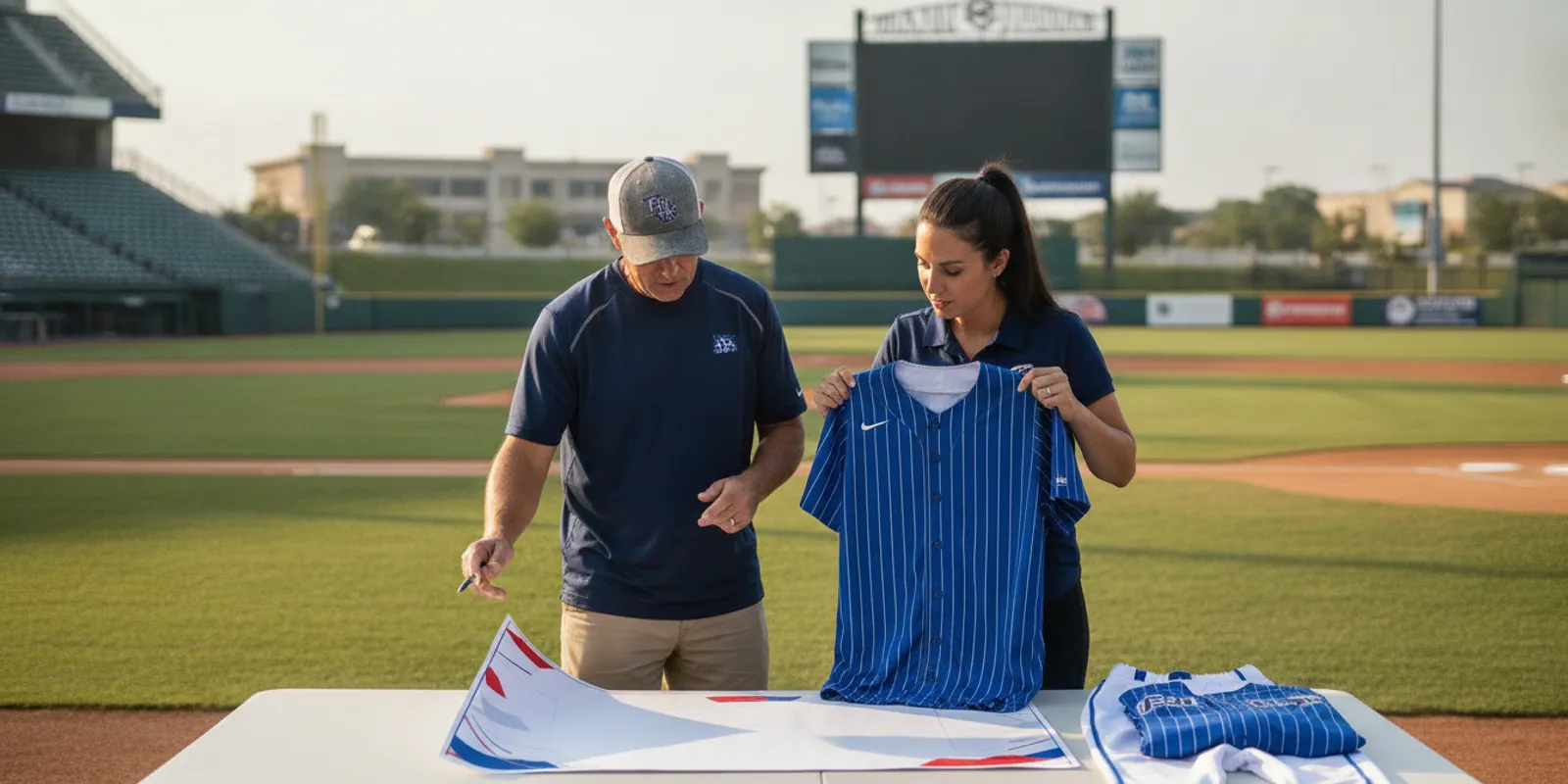
Check the proof for letter spacing, number outlines, logo proportions, and color relationships. Inspect the front and back separately. Confirm that player numbers are easy to distinguish and that the name is placed consistently. If several garments use the same motif, check that each scale and placement feels intentional rather than copied without adjustment.
Uniforms Express offers multiple decoration methods, including sublimation, screen printing, heat press, embroidery, and tackle twill. The right choice should be confirmed for the specific garment and design. Do not assume every effect is suitable for every fabric or placement; ask the supplier to explain what the proof represents and how the selected construction will look on the finished item.
For general uniform identification guidance, consult the NCAA’s official playing rules resources and confirm the rules that apply to your team’s league or association. Requirements can differ by competition, so check the current governing documents before approving names, numbers, or other markings.
When choosing lettering, compare more than the font sample. Ask how the style looks in the actual number size and outline combination, then inspect the thinnest strokes. A narrow font may look elegant in a large heading but lose its shape when reduced. A block style may be easier to read, yet still need enough spacing to prevent adjacent digits from running together. Test every roster number, including combinations such as 11, 18, and 88, which can look crowded or similar when outlines are heavy.
Consider where names and marks sit relative to seams and movement. Keep critical details away from folds or areas that become hidden when a player bends or wears equipment. If the design includes a sleeve mark, verify that it remains visible on the intended garment and that left and right placements are consistent. These small choices matter most when a team appears together in warmups or photos, where uneven placement stands out.
Which uniform elements should teams compare?
Compare complete looks rather than judging a jersey in isolation. A practical review considers color balance, number clarity, customization, and how each piece fits into the team’s kit. This table can help coaches turn general preferences into specific decisions and catch mismatches before approving a design or collecting the full roster order.
Design element | What to compare | What a strong choice does | Check before approval |
Jersey base and accent | Contrast, field visibility, relationship to team colors | Creates a recognizable look without visual clutter | View under both bright and low-contrast conditions |
Numbers and names | Size, weight, outline, placement, legibility | Makes identification quick from the stands | Review front and back at reduced viewing size |
Logo or wordmark | Artwork quality, scale, location, fine detail | Builds team identity while remaining clear | Use approved artwork and inspect a scaled proof |
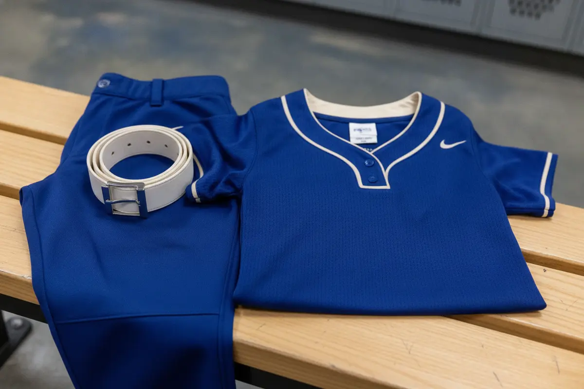
Pants and trim | Color match, piping, belt and sock coordination | Makes the full uniform look intentional | Compare every component in one complete mockup |
Decoration method | Desired finish, garment suitability, design complexity | Supports the appearance and use the team expects | Confirm construction and placement with the supplier |
Use the table as a decision record, not just a discussion prompt. For each row, write down the selected option and one reason. For example, “dark body with light outlined numbers because it stays readable in our evening games” gives future reviewers a useful standard. If the group cannot agree, compare two complete proofs that differ in one meaningful way rather than debating several changes at once.
Ask for views that show the full front, back, and side of the garment, as well as a close view of the lettering. A front-only rendering may hide a back-number issue or a color mismatch with the pants. The image should also show trim and accessories together. Reviewers can then judge whether a stripe aligns visually and whether the uniform still feels balanced from multiple angles.
How can the design reflect team identity without becoming crowded?
A memorable uniform usually has one or two signature details, not a different focal point on every panel. Use a mascot, monogram, stripe, or color block as the anchor, then let the remaining choices support it. The result can feel distinctive and polished while leaving the team name and numbers easy to recognize during play.
Start with what the team wants people to recognize first. For some programs, that is the school name; for others, it is a mascot mark or a strong color combination. Set that priority before adding secondary artwork. A subtle sleeve element or pant stripe can connect the pieces, but multiple competing patterns can make the uniform harder to read and less cohesive.
It also helps to think beyond one season. If the team expects to reorder, choose a design that can be reproduced consistently and document the details: color references, artwork versions, garment style, number font, and placement. Keep final proofs and approved files where the next coach or administrator can find them. For teams considering a full coordinated order, compare the available custom softball uniform options and discuss which pieces belong together.
Uniform identity is not limited to the jersey. Coordinated pants, socks, belts, and warm-up pieces can make the group look organized in pregame and between games. The goal is not to make every item identical; it is to repeat the same visual cues in a deliberate way. One consistent accent color or repeating stripe may be enough to tie the kit together.
Build a simple identity brief before design review. Include the team’s first-choice color, supporting colors, the main name or mascot, and any element that must stay unchanged from an existing program identity. Then list what is flexible: sleeve treatment, side panel, piping, or secondary mark. This distinction keeps feedback focused. It also prevents a committee from treating every preference as a requirement and turning a clear concept into a collage of unrelated ideas.
Consider the team’s actual use of each piece. If players wear warm-up tops over jerseys, check that the uniform identity still appears in team settings. If the team orders more than one jersey, make the connection obvious through repeated lettering, trim, or colors, while preserving enough contrast between options. A complete, consistent kit feels intentional even when individual garments have different roles.
Save a clean master file and a written description of approved colors and placements. Keep old drafts clearly labeled as superseded, so a later reorder does not accidentally rely on the wrong version. If the organization has separate school and club marks, identify which artwork is approved for this uniform. A few minutes of file organization can prevent a needless round of proof corrections in a later season.
What should coaches prepare before placing a uniform order?
Good preparation makes design approval and ordering more predictable. Gather roster information, apparel preferences, required game details, and decision-maker feedback before the proof review. Then verify the artwork, quantities, sizes, and schedule with the supplier. Uniforms Express notes game-ready turnaround can be as quick as two weeks in suitable circumstances; confirm current production timing, product availability, and any rush requirements for your specific order.
- Set the deadline.
Work backward from the first date players must wear the uniform, allowing time for design review, roster corrections, production, shipping, and a buffer for unexpected changes.
Choose the uniform scope.
Decide whether the order is for jerseys only or a coordinated set that includes pants and other items. Review the
alongside the relevant bottoms and accessories.
- Assign one roster owner.
Have a single coach or administrator collect each player’s name, number, and requested size. Use one current roster file and label any late additions clearly.
Check sizing carefully.
Consult the
and communicate the measurement method to families. Do not treat a player’s usual streetwear size as a guaranteed uniform size.
- Consolidate feedback.
Ask decision-makers to review one proof and send specific edits in one round where possible. Separate corrections from optional preferences so essential errors are addressed first.
- Verify the final approval.
Check spelling, numbers, colors, garment styles, quantities, and placements against the roster and approved proof before production moves forward.
Ordering timelines depend on the selected products, approval timing, and production needs. Ask for the current schedule rather than assuming a rush option applies automatically. For an order with a fixed tournament or season deadline, state that date at the start of the conversation. The team uniform planning resource can also help organize questions before you submit details.
Make sizing collection repeatable. Share the supplier’s chart and measurement instructions with every family at the same time, and give a clear return date. Record each response in one roster sheet with separate columns for player name, requested size, jersey number, garment choices, and confirmation status. Mark unanswered fields rather than guessing. Before sending the roster, filter for blanks, duplicate numbers, spelling variations, and entries that were changed after the proof was prepared.
For design approval, choose one person to gather comments and send a consolidated response. Ask reviewers to identify the exact area and requested correction: “increase the number outline contrast” is actionable; “make it pop” is not. Keep a record of the final approved proof and date. This creates a clear reference if someone later questions a detail or requests an addition.
Plan a realistic approval window. A team that waits until all families have responded may lose time, while an arbitrary early cutoff can produce rushed or incomplete information. Set deadlines for roster, proof feedback, and final sign-off, and tell families what happens if a detail is still missing. Confirm the supplier’s schedule after the team has settled its selections, since timing can depend on the final products and approval process.
How do teams keep the look consistent across sizes and future orders?
Consistency comes from documenting decisions and checking the actual order data, not from relying on memory. Keep an approved design proof and a roster record that agree with each other. When the team adds players or reorders, use those references to confirm garment styles, colors, artwork, decoration, and number conventions instead of starting from an old screenshot or an informal description.
During the first order, create a simple design record containing the final artwork, color choices, approved placement, garment names, and any accepted variations. Note which decisions are fixed and which can change for a new season. If a design includes separate home and away looks, label both clearly and make sure the associated pants and accessories are correctly paired.
For roster handling, use consistent naming and number formats. Check for duplicate numbers, spelling differences, and players listed on the wrong garment. Confirm how the order will handle any player whose size or name is pending. A final review by someone who did not prepare the roster can catch mistakes that the original editor has learned to overlook.
When the team grows, treat additions as a controlled update. Tell the supplier which approved design and order the new garments should match, then confirm availability and production timing. Do not assume that a product or detail from a previous season is unchanged. A fresh proof or written confirmation can prevent a small change in style or color from making a new garment look out of place.
Use these questions at the last review: Can every player be identified? Do the colors still read well together? Does each garment match the approved set? Are the roster and quantities final? Is the schedule confirmed? Clear answers make the design more useful than a mockup that merely looks good on a screen.
For reorders, distinguish a replacement from a redesign. A replacement should follow the approved record as closely as current products allow; a redesign can make deliberate changes, but should be reviewed as a new version. Write down which season or order each proof belongs to. If a player joins midseason, confirm whether the team expects the same garment and decoration details, then tell the supplier precisely what must match. This avoids the common problem of a new item looking almost, but not quite, like the existing set.
Think about storage and handoff as part of consistency. Keep the design file, roster template, proof, and notes in a shared team folder with clear names. Grant access to the next coach or administrator, and remove outdated working copies from the active folder. The process is simple, but it reduces dependence on one person’s memory and helps preserve the team’s chosen look from season to season.
Frequently asked questions
How do we choose a design that works for both home and away games?
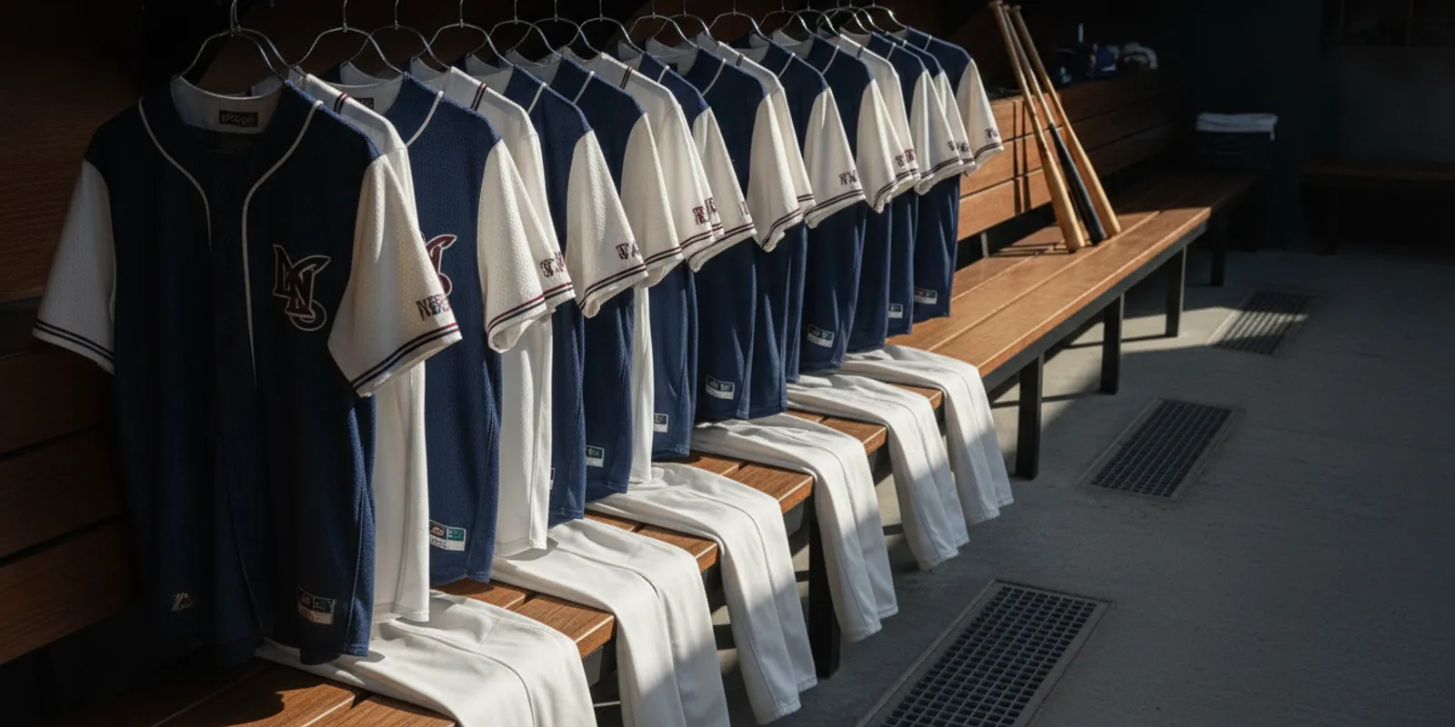
Build two looks around the same team identity, but make sure the dominant jersey colors provide clear contrast between sets. Keep recurring details such as the wordmark, number style, and trim consistent, then confirm league requirements and the actual field conditions before approval.
What should coaches check when choosing uniform sizes?
Use the supplier’s sizing chart and its stated measurement guidance, then collect each player’s information consistently. Allow players to check their own measurements where appropriate, and confirm whether the selected garment has a different fit than they expect. Verify all sizes against the final roster.
Which decoration method is best for a softball uniform?
There is no universal best method. The choice depends on the garment, artwork, desired finish, and placement. Compare the available methods with the supplier and inspect a proof showing the actual design details before deciding.
How quickly can a custom softball uniform order be completed?
Timing varies with product selection, approval, roster completeness, production capacity, and shipping. Uniforms Express says some orders can be game-ready in as little as two weeks, but coaches should share their deadline and confirm the schedule and any rush requirements for their specific order.
How can a team plan a uniform budget without losing design quality?
Set the team’s spending limit before choosing features, and request options that fit the intended scope. Compare complete sets rather than isolated pieces, prioritize readability and durable construction, and avoid paying for decorative elements that do not strengthen identity or serve a practical purpose. Confirm current product details directly, since pricing can change.
The best fastpitch softball uniform designs make the team recognizable, keep names and numbers clear, and give coaches a process they can repeat. Start with a practical palette, review the whole kit, and approve only after the proof and roster agree. That preparation helps the team take the field looking coordinated and ready to play.
Comments